7 Elements of Art
Elements of art are the core traits of an artwork, visually detectable and separately identifiable. There are six basic elements of visual art, which when juxtaposed in a particular manner create a work of art. They are line, shape, color, value form, and texture. Space can be added as one of the artistic elements as well. The key to understanding principles of art and art analysis is learning about these elements. Not all of them need to be a part of each painting, sometimes the deliberate absence of some of them is a distinguished characteristic of an art style. However, one rule goes for all of them – learning how to paint is necessary, besides and despite natural talent, knowledge is the elementary stepping stone for artistic achievement.
Line

Line is the simplest visual expressive means. It connects a certain distance between two points and it can be straight, curvy, angular or free. Width, direction and length of the line often define stroke of an individual artist. It is the crucial element in design and the necessary constituent of marks and signs. Thick or thin, line helps form shape and form, create a drawing and consequently it’s the most basic component of figural and many abstract artistic styles. Some of techniques, such as printmaking, are based on line, and some of drawing types are defined by simple lines alone, such as croquis.
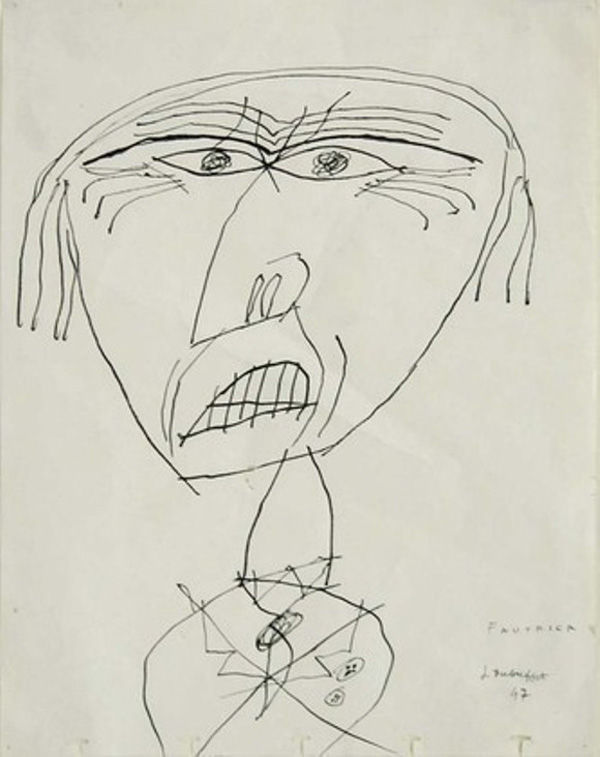
See the over-simplified Jean Dubuffet drawing. It reminds of a children’s piece, completed quickly with the use of clean lines. The drawing of a dog by David Hockney belongs to a different style, but it is simply executed with the line as the essential pictorial item.
Shape
Shape refers to area defined by edges – lines, which is two dimensional. It is often related to simple geometric figures such as triangle, square, rectangle, circle or various polygons. At the same time, it can emulate any of the outlines found in nature, depicting silhouettes of different animals, objects, people or plants. Shape cannot exist without other basic elements of art. They are also in charge of creating the subject matter, whether it is figurative or abstract art.
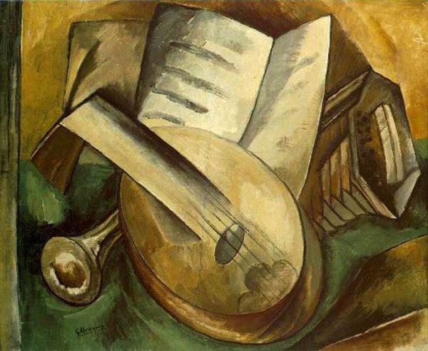
See how the basic geometry is used as such in De Stijl paintings of Piet Mondrian. On other side, cubism of Georges Braque leans onto these geometric shapes, but it uses them as foundation to build recognizable objects.

Color
Without color, there would be no art. Color sets the atmosphere in a painting, it describes emotions best, while styles such as Impressionism are based almost solely on color. Note the light nuances of Monet’s piece and the vibrant colors of Van Gogh’s landscape.

Color is the direct consequence of reflection of light and one of the most important elements of art. Color hues come in a scale, but there are three basic colors – blue, red and yellow. When mixed, these three colors produce all other nuances of the spectrum. First characteristic of color is therefore nuance or hue, defining the color, in terms we define as red, green, yellow, orange and so on. Intensity is the next trait of this pictorial element, describing the clarity of the hue, in the range from bright, deep and vivid to dull or pastel. Intensity often refers to saturation or its purity. Value is the third characteristic of color, defining its lightness or darkness. Each hue comes in a span of shades, tinted with white to become lighter or shaded with black to turn darker.
Value
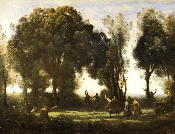
Value is the element of art responsible for the dramatic and emotional impression of an artwork, right next to color. It refers to the lightness and darkness of a piece, regardless of its hue. Sometimes named “tone”, value can be achieved by adding gray to the base – pure color. It’s irreversibly connected to light, just like color, but its purpose is to depict an illusion of light. Therefore, surfaces in a painting must be rendered in different values, even if the subject is all of the same nuance. Shading and tinting allow for the limitless transitions in surface rendering, and when executed skillfully, they evoke the natural appearance of things. If you look at the Vermeer’s masterpiece “Woman with a balance”, you will see how her skin and close appear lighter or darker, depending of the way the ray of light falls on them. Corot’s landscape depicts a green scenery, but as the light falls under various angles on the forest, grass and leaves appear darker or lighter.

Form
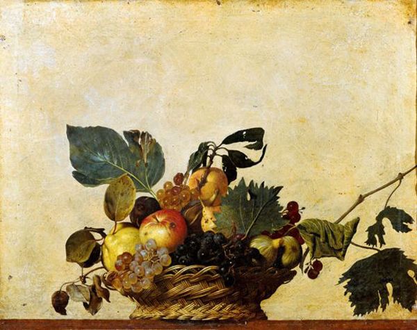
Form is referring to the three-dimensional figure depicted in a painting. It is defined by illusion of volume achieved by the use of shadows and perspective. Form as such is expected to have width, height and depth, and as in painting it is only an optical illusion, in sculpture it is the most important constituent. Forms, just as shapes, derive from geometry and can be cones, cubes, balls and similar, or from the natural world. Organic forms define all figures found in nature, from people, animals and plants, to other inorganic natural and irregular objects.

See how in his early work “Basket of Fruit” Caravaggio uses some of the basic elements of art to create the illusion of three-dimensional form. Art Deco was a modern and decorative style largely based on geometry, but the representation of form had a distinct three-dimensional characteristic, as seen in the work of Tamara de Lempicka.
Texture
Texture describes the tactile quality of the painted area, or the illusion of that quality. Therefore, it can be tangible or painted – simulated, emulating what a real texture of a fabric, stone, wood, skin may look like. In classical arts, simulated texture was used to depict fabrics, objects and porcelain tan, but as the modernity progressed and new techniques were emerging, real, tactile texture became more and more common. Texture provides richness, natural characteristic to the artwork, and its absence can be a deliberate statement as well. It’s achieved by combining other basic elements of art.
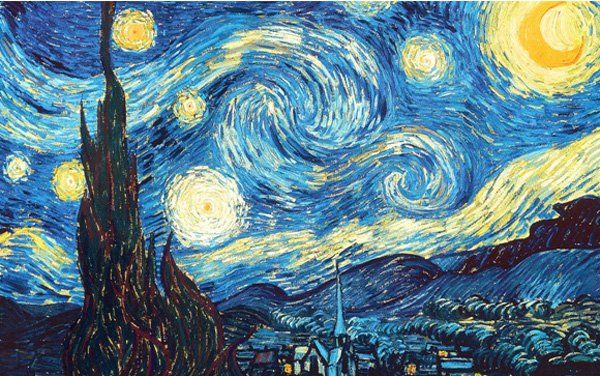
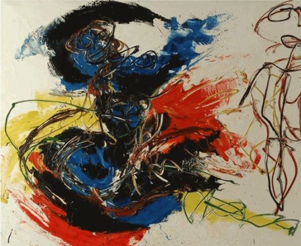
Texture in works of Van Gogh is just as important as their color. Thick and weighty impasto of Karel Appel emphasizes the expressiveness and emotion of his abstract paintings.
Space
Space is the area surrounding or filling the artwork and the painted subject. Classical art has long been devoted to creating an illusion of space, while modern art has managed to negate it in many ways. Modernity brought about the idea of a positive and negative space. Positive space is the space occupied by the subject, while negative space surrounds it.
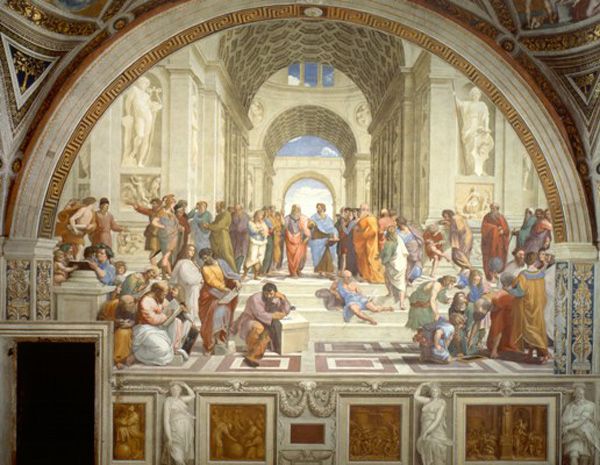
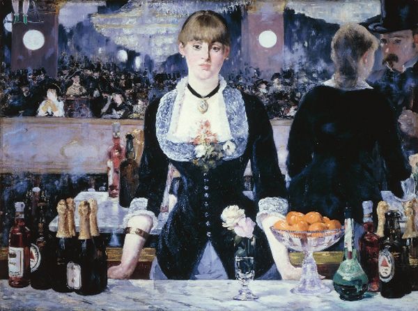
In Renaissance, perspective was the key tool to achieving the illusion of profundity and space. Note how Raffaello builds his interior with architectural plans along with the square tiled floor, following the balanced rules of perspective. Manet’s masterpiece “A Bar at Folies-Bergere” is an early modern, impressionist piece, which creates space through a mirror reflection, in juxtaposed planes rather than in academic perspective.
28.06.2024 @ 11:04
This piece was both informative and amusing! For more, visit: LEARN MORE. Keen to hear everyone’s views!